Puddle
END-TO-END MOBILE APP DESIGN
Puddle is a fin-tech app that allows groups to seamlessly collect, manage, and spend money together on shared purchases via a shared debit card.
BACKGROUND
Puddle was founded by 3 teammates and I during LavaLab, an 8-week incubator at USC.
ROLE
Co-Founder & UI/UX Designer | Idea Generation, Market Research, Wireframing, Prototyping, Brand Development
DURATION
10 weeks | Sep 2022 – Dec 2022
TEAM
Me (Designer)
Kelcie Fan (Developer)
Jenny Kim (Developer)
Ralph Jeanty (PM)
Puddle is a fin-tech app that allows groups to seamlessly collect, manage, and spend money together on shared purchases via a shared debit card.
TEAM
Me (Designer)
Kelcie Fan (Developer)
Jenny Kim (Developer)
Ralph Jeanty (PM)
BACKGROUND
Puddle was founded by 3 teammates and I during LavaLab, an 8-week incubator at USC.
ROLE
Co-Founder & UI/UX Designer | Idea Generation, Market Research, Wireframing, Prototyping, Brand Development
DURATION
10 weeks
Sep 2022 – Dec 2022
Research + Analysis
My team and I interviewed about 40 people from the ages of 18-60 to gain a deeper understanding of the customer and problem space regarding how groups currently split money and pay each other back. We identified four pain points and summarized them into our problem statement.
After defining our problem statement, my team and I brainstormed a solution that would make group-spending hassle-free. We conducted a competitor analysis against Venmo and Splitwise, two apps that are currently used when splitting money. (Neither of these allow for shared debit cards or money pools!)
Problem Statement
Our Solution
Competitor Analysis
Create a "puddle" and invite your friends to join
Collect money as each member pools a certain amount
Spend directly from the pool on shared purchases


PAIN POINT #1
🤷♀️ People often forget to pay each other back
"I paid for my friends food on a surfing trip. We were too caught up in the moment and I forgot to ask them to pay me back.”
PAIN POINT #2
💳 Multiple transactions are required after the purchase.
“Usually one person pays and Venmo requests everyone. People don’t pay back right away though and its annoying to have to wait for them.”
PAIN POINT #3
⏰ Calculating money owed is time-consuming.
"I made a spreadsheet to figure out how much money we owed each other but it took so much time and it was confusing.”
PAIN POINT #4
😅 It can be awkward to hold friends accountable.
“It's been a week and my friend still hasn’t paid me back. It feels weird to ask her now so I don't know what to do.”
Research + Analysis
My team and I interviewed about 40 people from the ages of 18-60 to gain a deeper understanding of the customer and problem space regarding how groups currently split money and pay each other back. We identified four pain points and summarized them into our problem statement.
PAIN POINT #1
🤷♀️ People often forget to pay each other back
"I paid for my friends food on a surfing trip. We were too caught up in the moment and I forgot to ask them to pay me back.”
PAIN POINT #2
💳 Multiple transactions are required after the purchase.
“Usually one person pays and Venmo requests everyone. People don’t pay back right away though and its annoying to have to wait for them.”
PAIN POINT #3
⏰ Calculating money owed is time-consuming.
"I made a spreadsheet to figure out how much money we owed each other but it took so much time and it was confusing.”
PAIN POINT #4
😅 It can be awkward to hold friends accountable.
“It's been a week and my friend still hasn’t paid me back. It feels weird to ask her now so I don't know what to do.”
Problem Statement

After defining our problem statement, my team and I brainstormed a solution that would make group-spending hassle-free. We conducted a competitor analysis against Venmo and Splitwise, two apps that are currently used when splitting money. (Neither of these allow for shared debit cards or money pools!)
Our Solution
Create a "puddle" and invite your friends to join
Collect money as each member pools a certain amount
Spend directly from the pool on shared purchases
Competitor Analysis

I created a collaborative whiteboard on FigJam and shared it with my team to begin the ideation process. The four of us jotted down the core features we wanted to incorporate in our app, as well as ideas for branding.
Ideation
Feature Brainstorm
Once I had a sense of the core functions of the app, I mapped out the user flow. I went over it with my team and revised the flow with their feedback.


Mapping User Flow
Ideation
I created a collaborative whiteboard on FigJam and shared it with my team to begin the ideation process. The four of us jotted down the core features we wanted to incorporate in our app, as well as ideas for branding.
Feature Brainstorm

Once I had a sense of the core functions of the app, I mapped out the user flow. I went over it with my team and revised the flow with their feedback.
Mapping User Flow

Design
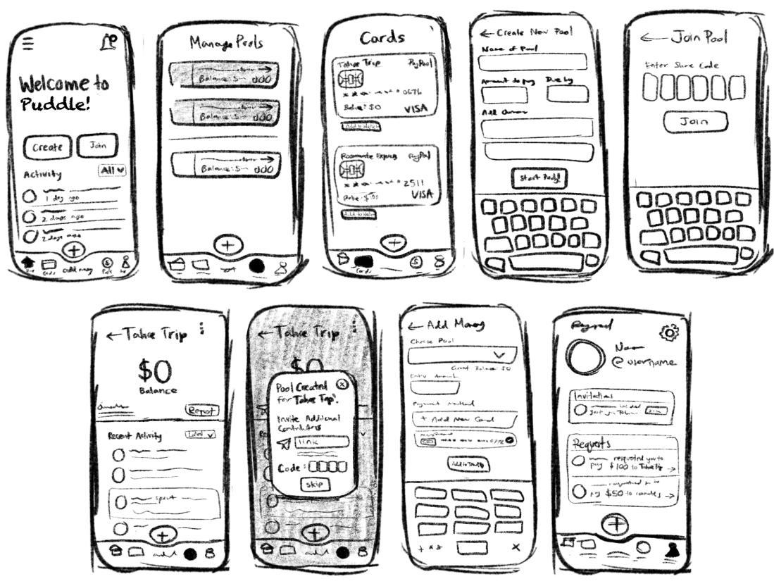
Here, I incorporated the features from our feature brainstorm into rough sketches using pen and paper. This helped me quickly visualize the user interface.
Sketches

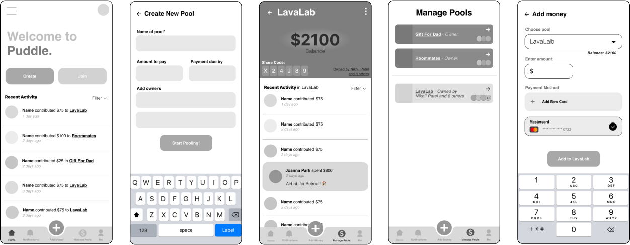
After sketching out my ideas with pen and paper, it was time to move into Figma. I developed the layouts from my sketches into mid-fidelity wireframes. By using gray-scale I was able to focus on usability without having to worry about colors and branding just yet.
Mid-fidelity Wireframes

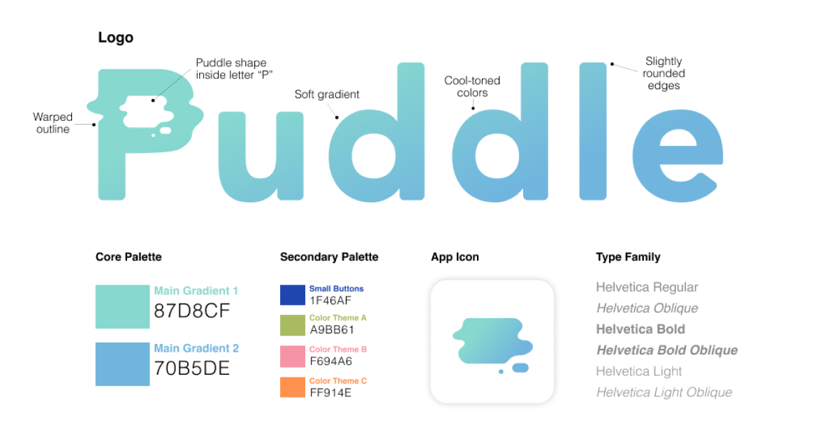
At this point in the design process, I felt ready to create a visual identity that accurately reflected our product's use. I incorporated gradients and pops of color, while keeping it minimal and clean.
Branding Guildines

Design
Here, I incorporated the features from our feature brainstorm into rough sketches using pen and paper. This helped me quickly visualize the user interface.
Sketches
After sketching out my ideas with pen and paper, it was time to move into Figma. I developed the layouts from my sketches into mid-fidelity wireframes. By using gray-scale I was able to focus on usability without having to worry about colors and branding just yet.
Mid-fidelity Wireframes
At this point in the design process, I felt ready to create a visual identity that accurately reflected our product's use. I incorporated gradients and pops of color, while keeping it minimal and clean.
Branding Guidelines
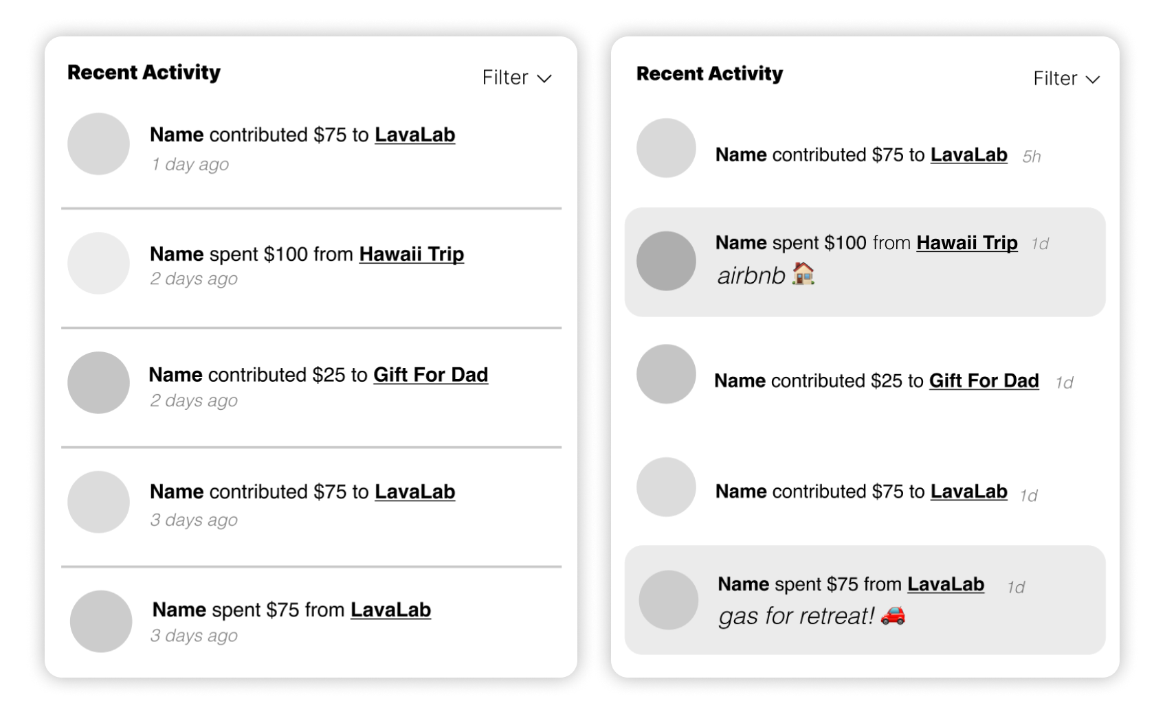
Update #1: Activity Feed
I collected feedback on my mid-fidelity wireframes from both designers in LavaLab and users in our target market. Using their critiques and suggestions, I revised my designs, as displayed below.
Feedback + Iteration
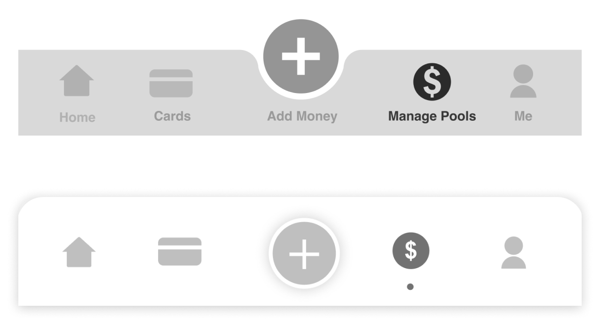
Update #2: Bottom Navigation Menu
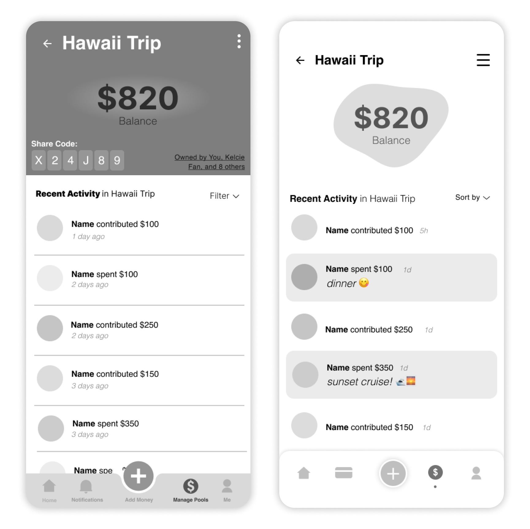
Update #3: "Manage Pool" Interface
❌ Difficult to distinguish between “contributed”
and “spent” notifications
✅ Highlight “spent” notifications
❌ "What are they spending on? 🤔"
✅ Display caption under “spent” notifications
❌ Feed looks cluttered
✅ Remove separating lines and abbreviate
timestamps
❌ Menu looks cluttered
✅ Removed labels and increased contrast
❌ "Why is it called Puddle? 🤔"
✅ Display money in a “puddle” shape to
emphasize brand identity
❌ Interface looks cluttered
✅ Hide share code and pool owners in menu
✅ Update activity feed and menu (with
changes shown above)
Feedback + Iteration
I collected feedback on my mid-fidelity wireframes from both designers in LavaLab and users in our target market. Using their critiques and suggestions, I revised my designs, as displayed below.
Update #1: Activity Feed

❌ Difficult to distinguish between
“contributed” and “spent” notifications
✅ Highlight “spent” notifications
❌ "What are they spending on? 🤔"
✅ Display caption under “spent” notifications
❌ Feed looks cluttered
✅ Remove separating lines and abbreviate
timestamps
Update #2: Bottom Navigation Menu

❌ Menu looks cluttered
✅ Removed labels and increased contrast
Update #3: "Manage Pool" Interface

❌ "Why is it called Puddle? 🤔"
✅ Display money in a “puddle” shape to
emphasize brand identity
❌ Interface looks cluttered
✅ Hide share code and pool owners in menu
✅ Update activity feed and menu (with
changes shown above)
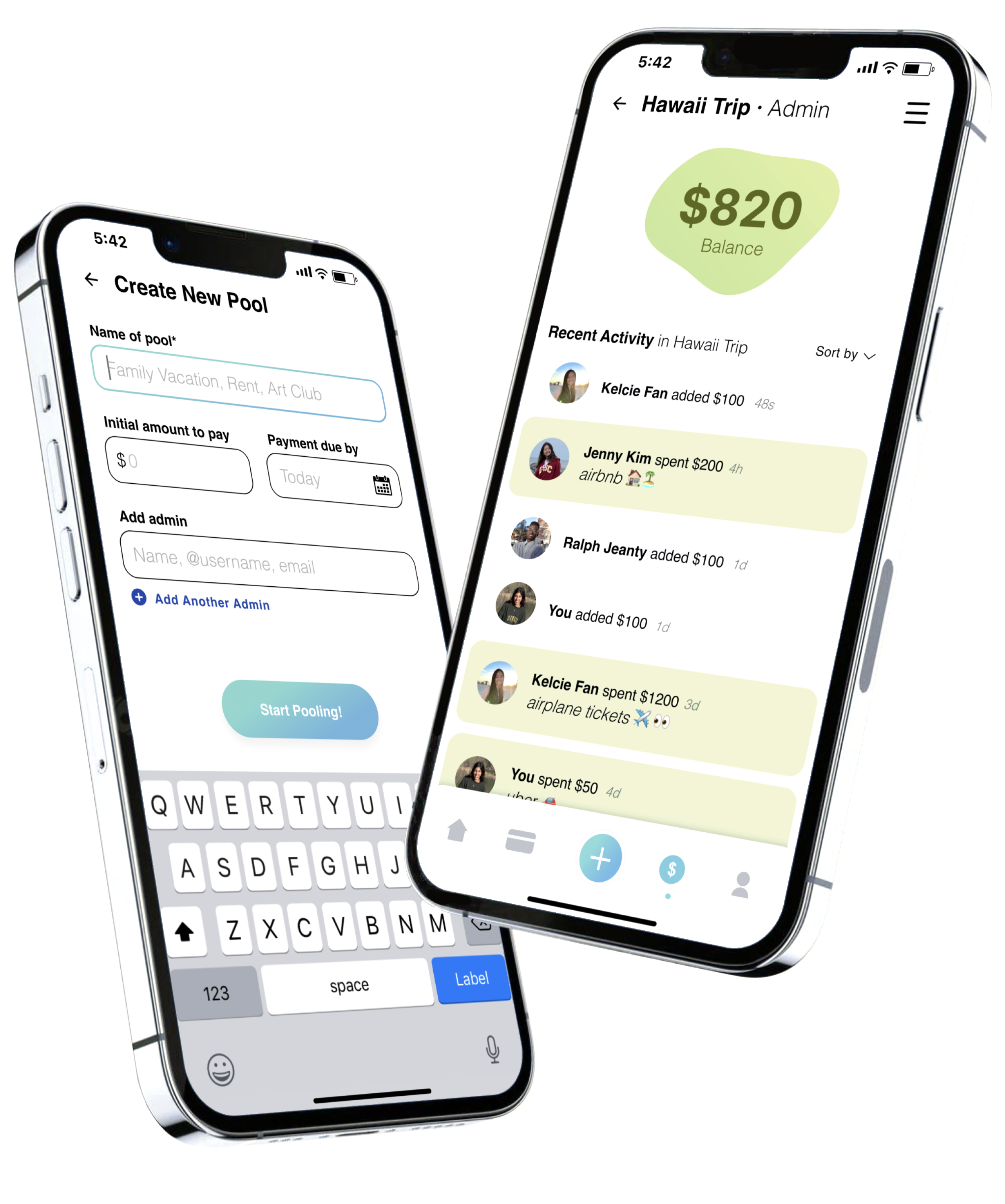
The Final Product
Collect and spend money together
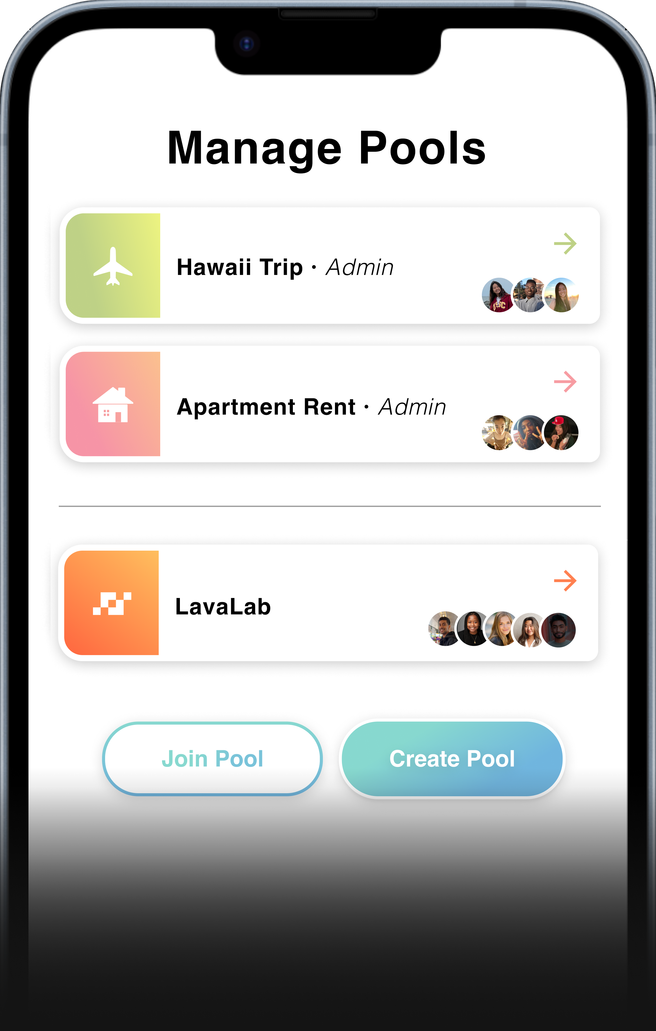
Join and create multiple pools
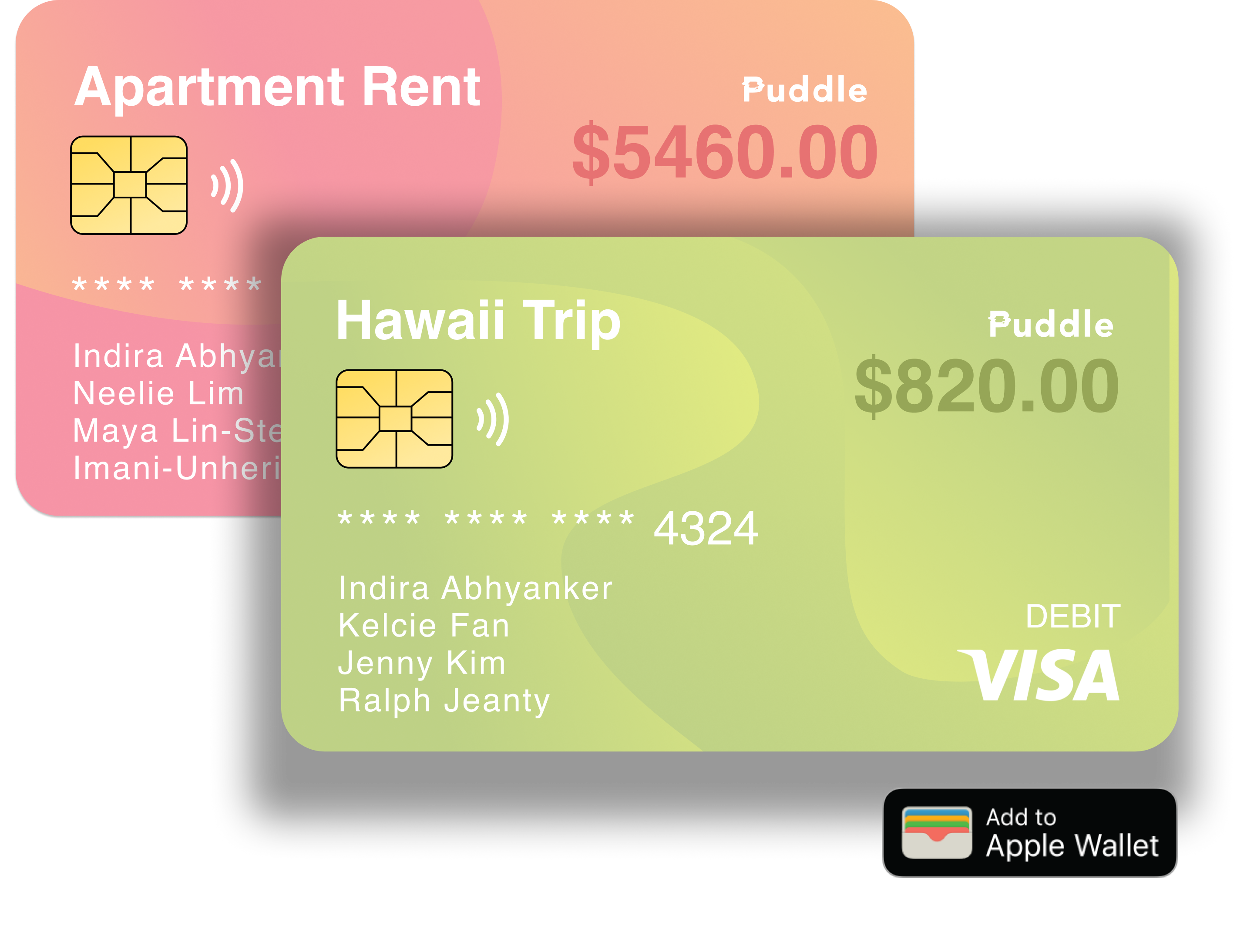
Everyone spends from one place
Figma Prototype (See below or click here)


The Final Product

Collect and spend money together

Join and create multiple pools

Everyone spends from one place
Figma Prototype (See below or click here)

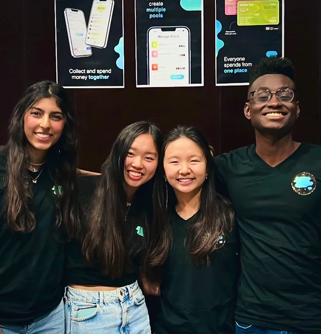
Lastly, I couldn’t have done it without my amazing team! This is picture of us at LavaLab’s Demo Night.
Pictured left to right: Me (Indira Abhyanker), Kelcie Fan, Jenny Kim, and Ralph Jeanty
Reflection + Next Steps
Throughout this 8-week experience, I learned so much about user research, decision-making, prototyping in Figma, and working under pressure. It was my first time being in a cross-functional team, which was an amazing opportunity to practice my interdisciplinary collaboration skills. Being the sole designer, I felt empowered to make critical design choices, while continually receiving constructive feedback from my teammates. Overall, I am really proud of the final product.
When it comes to further improving this design, some next steps would be...
Design a dark mode! With dark mode becoming more popular due to aesthetic preference and eye strain, this would be important to incorporate.
🖤
Onboarding! Including a few statements outlining the purpose of our product at the beginning of the user experience will drive product adoption.
🙌
More testing! Now that I have built the clickable, animated prototype in Figma, I will test it with our target market and make revisions.
⚙️
Lastly, I couldn’t have done it without my amazing team! This is picture of us at LavaLab’s Demo Night.
Pictured left to right: Me (Indira Abhyanker), Kelcie Fan, Jenny Kim, and Ralph Jeanty
